

Try it now!
Managing your investments has never been easier!






A comprehensive guide to the Treasury yield curve, its shapes, historical predictive power, and strategic implications for sophisticated investors.
The short version: The Treasury yield curve is a critical financial indicator that plots debt yields across maturities. When short-term yields exceed long-term yields, the curve inverts, historically signaling economic slowdowns and recessions. (What Is the Treasury Yield Curve? | Charles Schwab; Yield Curve | How Treasury Builds and Publishes It | AdviceOnly)
The yield curve is a fundamental tool used by investors, analysts, and economists to evaluate bond markets and interest rate expectations. According to the SEC's investor glossary, it is represented as a line graph showing the relative yields on debt over a range of maturities spanning from three months to 30 years. When the term is used without qualification, it typically refers to the US Treasury curve because Treasury securities share a single borrower and credit standing across all maturities. This means differences along the curve reflect time rather than credit risk.
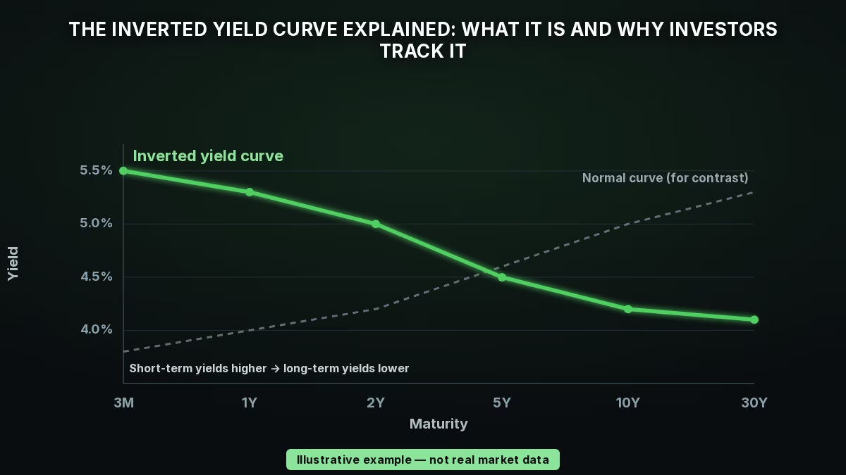
The yield curve generally exhibits three distinct shapes: upward-sloping (or positive), downward-sloping (or inverted), and flat. A normal, upward-sloping curve indicates that longer-term debt instruments carry higher yields than short-term ones, compensating investors for holding debt over a longer duration. A flat curve represents a transition phase where yields across different maturities are relatively equal, which usually occurs during the transition from positive to inverted or from inverted to positive, while an inverted curve occurs when short-term yields exceed long-term yields. Understanding these structural shapes is essential for market participants who monitor how interest rate expectations shift across different maturities over time.
| Yield Curve Shape | Yield Relationship | Market Implications |
|---|---|---|
| Upward-Sloping (Positive) | Long-term yields are higher than short-term yields | Indicates typical economic expansion and normal market conditions |
| Flat | Short-term and long-term yields are roughly equal | Often occurs during transitions between positive and inverted states |
| Downward-Sloping (Inverted) | Short-term yields are higher than long-term yields | Historically associated with economic slowdowns and potential recessions |
An inversion of the yield curve is driven by shifting investor expectations and central bank actions. When the economy has been in an expansion for an extended period, monetary policy often shifts toward normalization, leading to anticipated increases in short-term interest rates. As the Federal Reserve raises short-term rates to cool inflation, the short end of the yield curve shifts upward. If monetary policy becomes highly restrictive, these elevated short-term rates begin to slow economic activity. This upward shift of the entire yield curve is likely due to revised expectations about inflation and monetary policy. Decision makers must monitor whether these elevated short-term rates and tight monetary policy are actively slowing down the economy, potentially causing future recessions. This dynamic highlights the importance of tracking policy normalization paths and their direct transmission to short-term borrowing costs across the curve. (Information in the Yield Curve about Future Recessions - San Francisco Fed)
Simultaneously, long-term yields are heavily influenced by long-run growth and inflation expectations. When investors anticipate a future economic slowdown or a pivot toward lower interest rates, demand for long-term Treasuries increases, driving their prices up and yields down. This combination of rising short-term rates and falling long-term expectations causes the curve to flatten and eventually invert. Historically, inverted yield curves have been associated with a slowdown in the economy and potentially a recession. The 3-month bill closely tracks the current policy rate, so the 3m10y spread directly captures the gap between current policy and the long-run growth and inflation expectations embedded in the 10-year yield. Investors must evaluate whether a flattening curve is signaling an imminent economic transition or if it merely reflects temporary market adjustments, as the causes of these shifts provide crucial insight into whether overall market sentiment is optimistic or pessimistic.
Economists and market participants track several specific yield spreads to gauge recession risk. The most commonly cited measures of the term spread are the difference between the 10-year and 2-year nominal Treasury yields, and the difference between the 10-year and 3-month Treasury yields. While practitioners often focus on the 10-year minus 2-year spread, academic studies frequently analyze the 10-year minus 3-month rate. To evaluate these indicators, researchers also look at alternative candidates for the long-term spread, such as the 10-year minus 1-year spread. When analyzing these various term spreads, analysts must determine which specific maturity gap best serves their forecasting models. This choice is critical because different spreads can diverge, as documented in research comparing the recent evolution and predictive power of the 10-year minus 3-month, 10-year minus 1-year, and 10-year minus 2-year Treasury yield spreads. (The Fed - (Don't Fear) The Yield Curve)
The 3-month Treasury bill closely tracks the Federal Reserve's current policy rate. Consequently, the 10-year minus 3-month spread directly captures the gap between current monetary policy and the long-run growth and inflation expectations embedded in long-term yields. A deep inversion in this spread occurs when short-term rates are significantly higher than long-term yields, reflecting highly restrictive policy relative to long-term economic expectations. To make this concrete, if the 10-year US Treasury yields 4.10% and the 3-month bill yields 5.25%, the 3m10y spread is 4.10% minus 5.25%, which equals -115 basis points, representing a deep inversion. By contrast, a +200 basis points upward-sloping curve, where the 10-year is at 4.50% and the 3-month is at 2.50%, maps to a recession probability near 4%, essentially indicating that the bond market signals everything looks fine. Decision makers use these specific basis point thresholds to quantify recession probabilities.
| Spread Type | Primary Focus | Key Characteristic |
|---|---|---|
| 10-Year minus 2-Year | Commonly cited by practitioners and financial press | Reflects medium-term monetary policy expectations against long-term outlook |
| 10-Year minus 3-Month | Frequently analyzed in academic research | Directly captures the gap between current policy rates and long-run expectations |
The yield curve has earned a reputation as a highly reliable leading indicator of economic downturns. Historically, every US recession since 1969 has been preceded by a yield curve inversion. When short-term interest rates rise above the level of long-term rates, a recession has almost invariably followed within the next year or two. Specifically, a simple rule of thumb that predicts a recession within two years when the term spread is negative has correctly signaled all nine recessions since 1955 and had only one false positive, which occurred in the mid-1960s when an inversion was followed by an economic slowdown but not an official recession. Corporate treasurers and bond traders rely on this robust historical track record to position duration and size capital expenditure plans, making the monthly publication of the headline number by the New York Fed a critical checkpoint for macroeconomic risk assessment.
In evaluating these historical signals, decision makers should consider that traditional measures of a long-term spread—such as the yield difference between a far-off maturity like 10 years and a shorter maturity like 1 or 2 years—may be statistically dominated by a more economically intuitive alternative known as the near-term forward spread. This alternative spread can be interpreted as a direct measure of market expectations regarding the direction of conventional near-term monetary policy. Furthermore, unlike far-term yield spreads, the near-term forward spread has not been trending down in recent years, and survey-based measures of longer-term expectations for short-term interest rates show no sign of an expected inversion. This highlights a key limitation of relying solely on commonly cited term spreads, which have dropped over the past several years and raised concerns in the financial press.
The transition from an inverted curve back to a normal, upward-sloping shape is known as steepening, or normalization, and it can unfold in two distinct ways. In a bull steepening, short-term yields fall faster than long-term yields, typically when investors expect the central bank to cut rates aggressively to support a slowing economy. In a bear steepening, long-term yields rise faster than short-term ones, usually reflecting stronger growth or rising inflation expectations. Although both paths end in an upward-sloping curve, the widening gap between short and long rates carries a different message in each case, so the cause of a normalization matters as much as the normalization itself for investors trying to read the economic outlook.
Putting the yield-curve signal to work is mostly a matter of process. A fresh inversion is most useful as a prompt to review a plan: an investor can check how much near-term cash and short-maturity reserves are on hand, confirm that upcoming spending needs are matched by bonds maturing around the same time, and verify that the overall mix of assets still reflects their own risk tolerance and time horizon. Because the signal describes broad conditions rather than a specific date, this kind of scheduled review tends to be far more useful than trying to trade around the exact turn in the cycle. It also helps to know where the underlying numbers come from: the benchmark yields these signals are built on are published and maintained by the U.S. Treasury on a consistent basis, so periodic refinements to how the figures are calculated do not disrupt an investor's ability to compare the same spread across many years. That long-run consistency is part of what makes the curve a durable reference point rather than a passing market fad. (Yield Curve Methodology Change Information Sheet | U.S. Department of the Treasury)
Investors should also remain aware of structural shifts in the market. For instance, some economists argue that historically low long-term rates may not solely reflect a pessimistic economic outlook, but rather a 'new normal' for interest rates driven by a lower natural policy rate. Additionally, large-scale monetary interventions like quantitative easing (QE) can suppress long-term yields, contributing to curve flattening without necessarily indicating an imminent increase in recession risk.
While the yield curve is a powerful forecasting tool, investors should weigh its signals against broader macroeconomic indicators and avoid relying on any single metric to drive portfolio allocation decisions. When evaluating these signals, portfolio managers must analyze whether curve movements reflect temporary market adjustments or genuine cyclical deterioration. Understanding these nuances helps avoid premature defensive positioning when the curve flattens, ensuring that strategic decisions are based on a comprehensive view of the economic landscape.
The inverted yield curve endures as one of the most closely watched signals in finance because it distills complex expectations about growth, inflation, and monetary policy into a single, observable relationship between short-term and long-term rates. It has earned that attention through a long and remarkably consistent historical track record, yet no single indicator should drive a portfolio on its own. The most useful way to treat an inversion is as an invitation to ask sharper questions about risk, liquidity, and time horizon, and to keep revisiting those questions as the curve and the wider economy evolve rather than reacting to any one reading in isolation.
Use 8FIGURES to inspect your portfolio inputs and prepare better questions for your own review.
Managing your investments has never been easier!